Architecture Studio Crafts a Colour-Driven, Family-Friendly Space with Brand-Defining Lighting by Studio De Schutter
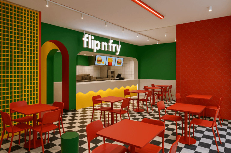
Berlin’s Flip N Fry flagship has unveiled a bold new interior conceived by architecture studio Bruzkus Greenberg, transforming the family-oriented hamburger restaurant into a brightly coloured, texture-rich destination designed to support future expansion of the brand. The scheme, complemented by a distinctive lighting concept from Studio De Schutter, aims to establish a recognisable visual identity for the chain as it grows.
Presented in Berlin in November 2025, the project emphasises a highly curated blend of colour, materiality and spatial organisation. Bruzkus Greenberg was tasked with creating an upbeat, welcoming and memorable environment that could be replicated across multiple locations while still delivering a sense of quality and personality. The practice’s use of bold zoning, tailored furnishings and expressive lighting seeks to deliver what the team describes as a “branded spatial identity” that customers can associate with the experience of enjoying a well-made burger.
Colour Zoning and Spatial Identity
At the heart of the design is a striking approach to colour blocking. The ordering zone and main dining area are unified in yellow, while the kitchen and food pickup area shift to warm terra-cotta tones. A continuous terra-cotta ceiling helps to visually connect the front and rear of these spaces, which occupy a single long room typical of early twentieth-century Berlin buildings.
A contrasting blue denotes transitional areas, including the threshold between exterior and interior and a prominent table set within a bay window. The back-of-house area, including the WCs, is rendered in a blue-and-white palette. A stainless steel datum line wraps the space, bringing cohesion across the different zones.
Textures and Material Detail
Texture plays a central role in the concept. The architects developed the spatial palette alongside the graphic branding but intentionally differentiated the physical materials from the marketing imagery. Wood panels were stained yellow rather than painted, ensuring the grain remains visible. Glossy epoxy flooring reflects the pattern of the lighting, while mosaic tiles bring texture and depth to the terra-cotta service counter and adjacent walls. Stainless steel elements add what the designers describe as a subtle, dull shine.
Partner Ester Bruzkus explains: “It’s not just the colors, it’s the textures.”
Replanning the Historic Site
A significant part of the planning involved rethinking the historical layout of the premises. Located on the ground floor of a listed building, the long, narrow space receives daylight only from the street façade. The team re-established a former side entrance to improve circulation and repurposed the bay window—once used as an entryway—into a dedicated family seating area featuring a freestanding table and custom pendant light. Expanded window glazing increases transparency between the restaurant and the street, drawing passers-by into the lively interior.
Lighting as Brand Identity
Lighting is a major component of the brand identity, developed in collaboration with Studio De Schutter. The overhead lighting system forms a graphic pattern visible from outside, helping to establish the restaurant’s street presence. The fixtures follow a clear geometric arrangement that unifies the programmed zones beneath them.
Partner Peter Greenberg states:
“The lighting forms a graphic pattern that is intended to be identifiable with the restaurant.”
Furniture and Flow
Furniture design further reinforces the project’s emphasis on character and clarity. Custom-built banquette seating is crafted from stainless steel, dyed wood veneer with an expressive grain, and soft fabric upholstery—combinations of hard and soft, glossy and matte materials that echo the broader interior palette. The stainless steel datum line integrates into the built-in seating, extends into the service counters, and forms the top surface of the freestanding pickup counter.
Zones of contrasting colours not only lend the restaurant its vibrant personality but also support wayfinding and operational clarity. As Greenberg notes, “The restaurant is supposed to be colorful and fun but worth looking a little closer at too.”


